Most of us aren’t interior decorators by trade, which means it can be a challenge to understand the industry lingo–especially when it’s referring to color. Honestly, it’s so easy to walk into a store and pinpoint the colors we love simply by looking at them. Unfortunately, when it comes to decorating the home, this superficial process doesn’t cut it. Why? Because the subject of color goes much deeper that.
What can we do? Well, two things. The first is to continue picking colors on a whim. The second is to learn more about how colors work. Both will bring color to your home, but only one will provide stellar results.
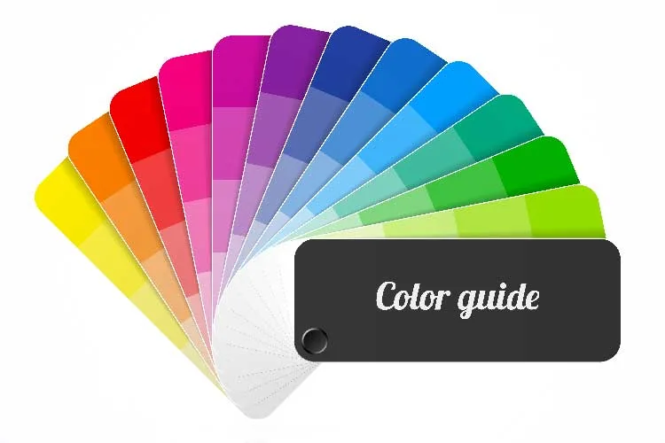
To help, we’ve put together a little guide about color. Hopefully, after reading through it, you will feel more confident the next time you’re faced with paint chips and fabric swatches.
The Color Wheel
col·or (noun): the property possessed by an object of producing different sensations on the eye as a result of the way the object reflects or emits light.
You probably remember learning about the color wheel as a school-aged child. If it’s been awhile since you’ve given it much thought, now’s a great time to refresh your memory.
Simply put, the color wheel gives us a visual of which colors blend well together. The average wheel model covers 12 colors, which can be broken down into 3 broad categories: primary, secondary, and tertiary colors.
- Primary colors include red, blue, and yellow. They are stand-alone colors, meaning they cannot be made from mixing other colors.
- Secondary colors include orange, purple, and green. These colors are created when mixed with the two primary colors that flank them. For example, red and yellow make orange, blue and yellow make green, and red and blue makes purple.
- Tertiary colors are the six shades that can be made by mixing primary and secondary colors. They are a blend of a secondary color and the primary color closest to it on the color wheel. They are not half and half blends, but rather a blend containing more of one color than another. Mixing the primary color yellow, with the secondary color orange, will give you the tertiary color yellow-orange. Another example would be red (primary) mixed with orange (secondary), which would make red-orange. Other tertiary colors are blue-green, yellow-green, blue-violet and red-violet.
Tip: To get a colorful interior started, pick your favorite color from the 12 and use it as a guide to narrow down your selections until you settle on the exact shade you want.
The Relationship Between Colors and Neutrals
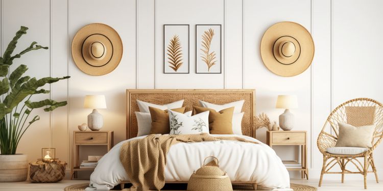
When it comes to interior decorating, there is so much information regarding color and neutrals. And naturally, everyone has their own opinion about it. Some people thrive on color and have no hesitation whatsoever about bringing it into their home. Others are more reserved, opting for a neutral interior with pops or hints of color scattered throughout. Neither is wrong, just different.
What some people don’t realize, however, is that colors and neutrals have a much more intimate relationship than the obvious contrast we see within a color scheme. Colors and neutrals are such a tight unit, they actually influence each other to create many different versions within a specific color family. Simply put, combining a color with a neutral will make a basic color lighter or darker. This is what we call tint, tone, and shade.
- Tint is the mixture of a saturated color with white, which increases lightness. All pastels would be considered a tint.
- Tone is the mixture of a saturated color with gray, making it slightly darker.
- Shade is the mixture of a saturated color with black, which reduces lightness. All muted colors would be considered shades.
If you don’t have art supplies available to play with color, you can get an idea of tinting and shading by visiting your local home improvement store for samples.
Tip: To make sure the colors you choose work together in the best way possible, make sure they have the same value. Value refers to the relative lightness or darkness of a certain area.
Understanding Color Temperature
You may have heard colors described as being warm or cool. These temperatures describe where the color falls on the color wheel.
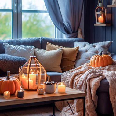
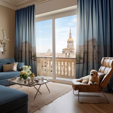
Colors described as warm colors are typically more vibrant and seem to liven up or add intimacy to a space. Warms colors include reds, oranges, and yellows. Colors described as cool bring a calm and relaxing feel to a space. These cool colors include blues, purples, and most greens.
When choosing a color temperature, take the size of the room into account. For example, a small room in warm colors could make the room feel cramped, while cool colors could make a spacious room appear stark.
Color Schemes
Color schemes can be broken down in a variety of ways, but we’re only going to focus on a small handful: complementary, split-complementary, analogous, and monochromatic.
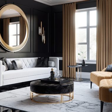
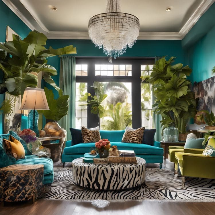
Complementary color schemes are the simplest. Complementary colors are colors that are opposite to each other on the color wheel (i.e. green and red, purple and yellow, orange and blue). Typically, one color acts as the dominant shade and the other as an accent.
The high contrast of complementary colors creates a vibrant look especially when used at full saturation and is best used in small doses when you want to draw attention to a particular design element. To keep the eye from becoming overwhelmed, embrace neutrals.
Keep in mind that you don’t have to stick with the literal colors on the color wheel in order to get complementary colors. Today, there are updated schemes that can be executed brilliantly with wall color, accents, and fabric on chair cushions and pillows.
Split-Complementary color schemes are a bit safer in that they aren’t as bold as many complementary color schemes. Instead of choosing the color directly opposite of your base color, you would choose the two shades on either side of the opposite (complementary) color. These two shades will bring both balance and a calming effect to the space, allowing you to rely less on neutrals.
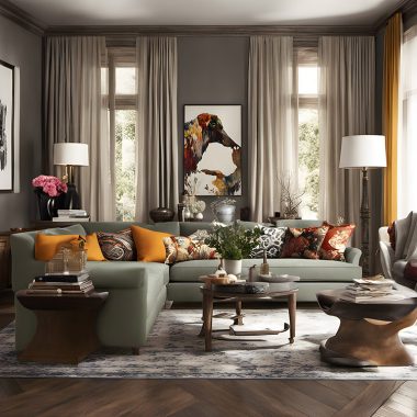
Analogous refers to using three colors in a row on the color wheel. In most cases, two colors will be primary, while the third will be a mix of those two and a secondary color. Some examples would be red, orange, and yellow; red, purple, and blue; green, yellow-green and yellow; or red, red-violet and violet. For optimal results, stick with the 60-30-10 rule, which means there will be one dominant color, one supportive color, and one accent color.
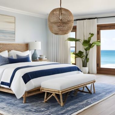
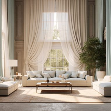
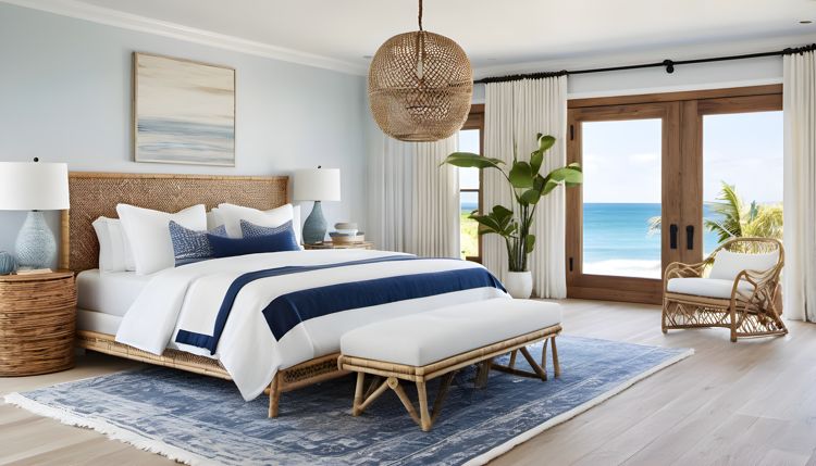
Monochromatic color schemes, or palettes, start with a single hue. Any additional colors used are variations of that specific hue (i.e. its tints, tones, and shades). A well-executed monochromatic scheme is anything but boring. In fact, it can be exciting and attention-grabbing.
To explain it a little better, here’s an example: A monochromatic room in blue might start with a single shade of blue paired with white. It might also include pale blue walls, medium blue window treatments, and dark blue upholstery. To tie the scheme together, the rug or accents might be a combination of blue and white. See how it works?
Now that you know more about color, we hope your decorating process becomes easier. If you still have questions, we will be happy to help you sort through our fabulous assortment of designer fabrics at Cutting Corners in Dallas, TX. Feel free to stop in and we will assist you with all of your fabrics questions!