Many homeowners are hesitant when it comes to color. While mixing and matching certain colors can be tricky, it doesn’t have to be scary. The good news is that you can still have a stunning home interior by using neutral colors.
Neutrals aren’t as “safe” as you might think…
Neutral. That word tends to make people think boring or safe–you know, that palette that doesn’t require much thought. That couldn’t be further from the truth! If anything, using neutrals in the home takes quite a bit of planning.
Although it might appear that neutrals such as beige, ivory, taupe, black, gray and shades of white lack color, these hues often have hidden undertones that only present themselves in certain applications. For example, beige might have an undertone of pink, tan, or gold and white might be slightly ivory, yellow, bluish or peachy. You might not notice this right away, so be sure to view color samples in various locations and light settings within your home before going all in.
Neutrals play nice with other colors…
In the context of interior design, neutral means without color. In no way does it mean without personality! In fact, colors that fall into the neutral zone have become more popular than ever in home decorating. Why? Well, when it’s done right, the use of neutral colors can be a very effective decorating tool that can lead to stunning results.
The beauty of neutrals is that they can “go” with anything. This gives you a ridiculous amount of creative freedom when it comes to decorating your home. No matter what trends or personal preferences come and go, neutrals will be the one constant that will give you a solid foundation for any decorating, or redecorating, you do over the years.
Now, let’s take a look at how you can keep those neutrals out of the boring zone and make them work in your favor.
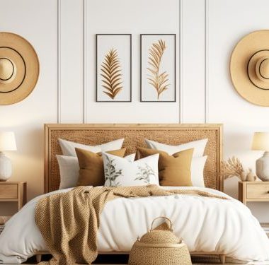
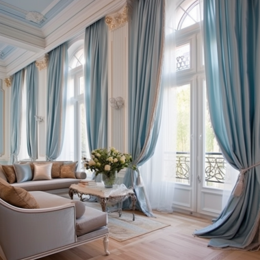
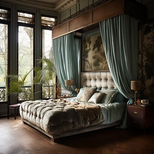
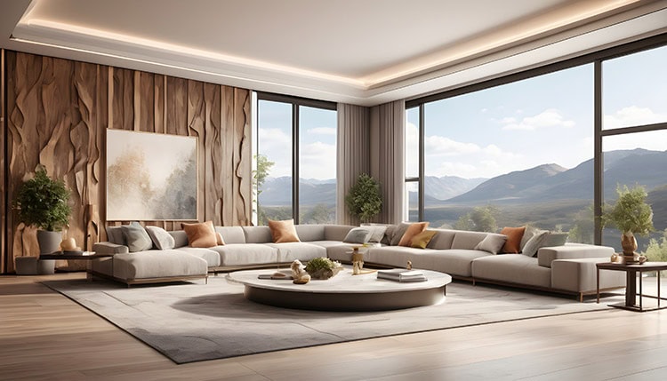
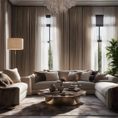
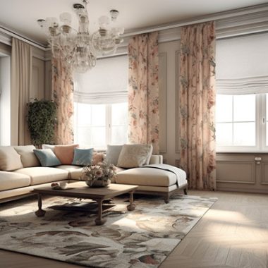
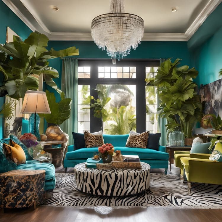
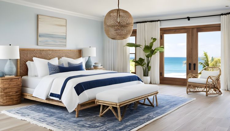
- Neutral doesn’t always have to mean beige. This is probably one of the most important things to remember. There are other alternatives to beige or tan, so don’t feel as though you’re limited. White is an extremely popular choice and so is gray. Even soft greens and blues can serve as neutrals.
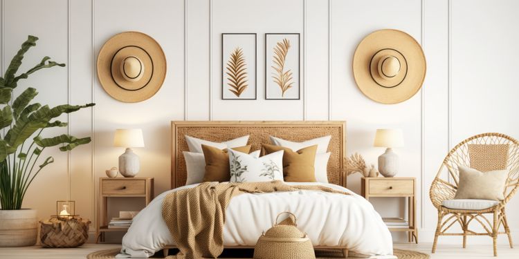
- But at the same time, beige can be really beautiful. If you think about it, the simplicity of beige has some perks. Being that it’s a visually quiet color, it can be the perfect choice in rooms where your focus is to have a space that doesn’t feel overly decorated. A room like that means the eye will be drawn to more important things, such as a great view out the window, a statement piece of furniture, or, when a group of people is in the room, each other.
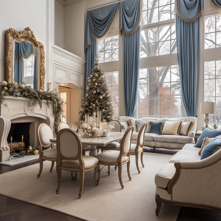
- Mix different hues of the same color. When it comes to a monochromatic color scheme, having several shades of the same color makes it much more interesting. To create depth combine a light, medium and dark hue together.
- Use texture to create interest. A variety of textures is anything but boring, so don’t hesitate to pile it on. Incorporate a variety of fabrics and layer in other textiles that create visual depth.
- Bring in patterns. As long as you have a common color, you can mix and match patterns as you please. Keeping within the same color or color family will actually complement each other no matter how contrasting the patterns look initially. On the flip side, you don’t need a lot of patterns to make the room look lively. Sometimes, people who use neutrals do so because of the serenity they can bring to a space. By layering in those textures mentioned earlier, varying the shades, and adding in something as simple as a striped rug, your room can look just as lively as one that has a plethora of patterns.
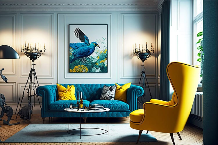
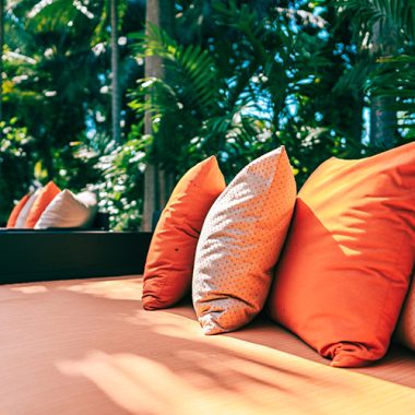
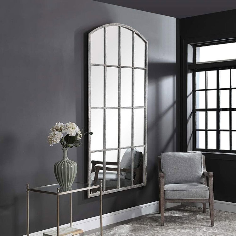
- Incorporate a statement piece. A statement piece is a great way to grab someone’s attention in a neutral room. It can be anything from a gorgeous area rug, an interesting piece of furniture, or a unique piece of artwork. With that said, a variety of smaller interesting pieces can have the same effect. Incorporate a variety of things like an eye-catching light fixture, a small accent table with intricate legs, or a vintage accessory. Even greenery can make a huge statement.
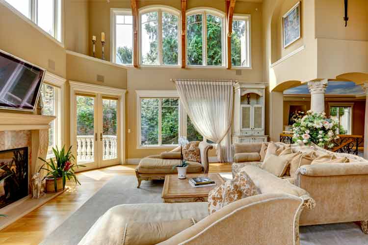
- Let architecture take the lead. If your home as interesting architectural accents, sometimes all you need to do is accentuate them. Features such as arched ceilings, fireplaces, and large windows provide a great focal point to work with.
- Mix materials. Having diverse materials within one space can create an enormous amount of visual interest. Don’t be afraid to decorate with a mix of materials. A combination of different elements like glass, metal, and wood definitely doesn’t come off as boring.
If you want to take your neutrals up a notch, stop by to see us. In addition to beautiful fabrics, we have a variety of furnishings and decorative accessories that can create an eye-catching interior.