Every color that we encounter has its own character and behaviors— each of which conveys messages that can alter our perceptions and moods. This alone can have a huge impact on several aspects of life, including how we decorate our home. Whether you are starting from scratch or updating your home’s current interior, color will at some point become the central focus. And while color is a wonderful thing that can add great beauty, personality, and style to space, it can be a complete disaster if you take the wrong steps. Instead of having to go back and correct bad results, get a smooth transition to new colors by avoiding these common color pitfalls.
1. Ignoring balance
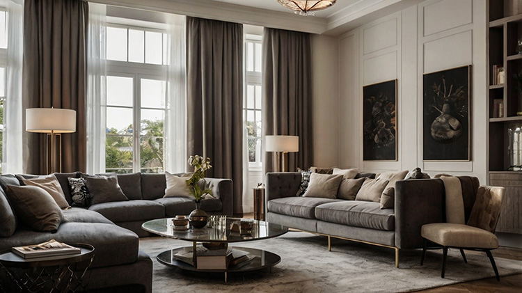
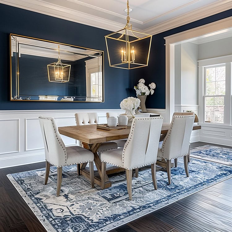
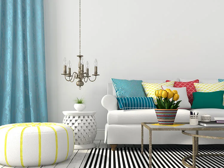
Sometimes, rules are meant to be broken— but when it comes to color, there are some rules worth at least considering, especially if you want the space to turn out well. Color, in regards to decorating, should be incorporated using the 60-30-10 rule. This means 60 percent of the space should be reserved for a primary or dominant color, 30 percent for a secondary color, and 10 percent for an accent color. The purpose behind this rule is to help make it easier to achieve visual balance within the space, that’s harmonious and pleasing to the eye. Any other ratios will make it really hard to achieve that.
2. Lack of color knowledge
It’s OK if you aren’t a color expert (that’s what the professionals are for) but you should at least be knowledgeable on the basics. Having even a slight understanding of how the color wheel works will get you far in your quest for the perfect palette. At a minimum, it’s a good idea to familiarize yourself with the 3 categories of color: primary, secondary, and tertiary. With that said, learning the difference between warm vs. cool, complimentary vs. contrasting, as well as what can actually be considered a neutral, will take you pretty far.
To learn more about color, read our related blog Understanding the Language of Color.
3. Attempting to match everything
There are different shades of colors for a reason, so don’t feel as though you have to use the exact same color continuously. Instead, use similar, but softer (or bolder) ones to create visual interest. Additionally, if you want something to stand out, like your upholstery, don’t match your wall color to it. It’s best to use a varying scale of color to keep it looking attractive. Can taking a risk on color be scary? Yes, absolutely. But if you don’t even give it a try, your interior will end up verging on stagnant. Keep it simple, varying your colors in easy-to-manage ways.
4. Jumping on the “trend wagon”
Trends come and go so quickly. Very quickly. Seriously, in many cases, you blink, and it’s gone. There’s certainly nothing wrong with trends, or even incorporating them into your home. In fact, there are some really great colors out there (among other home decor trends). Take Pantone’s seasonal choices, for example. Oftentimes, the color lineup they release in the spring and fall are second to none. And most can be used throughout the entire year, not just for a short span of time, which is perfect if you aren’t one to change up your decor frequently. With that said, it’s important to realize that certain “trendy” colors (like the ones that seem to really be “all the rage”) might be best to use the trend on a smaller scale. Think throw pillows, a lampshade, etc. Using a popular color in a big way often ends in regret, so choose how you use it carefully.
5. Picking colors that don’t make sense.
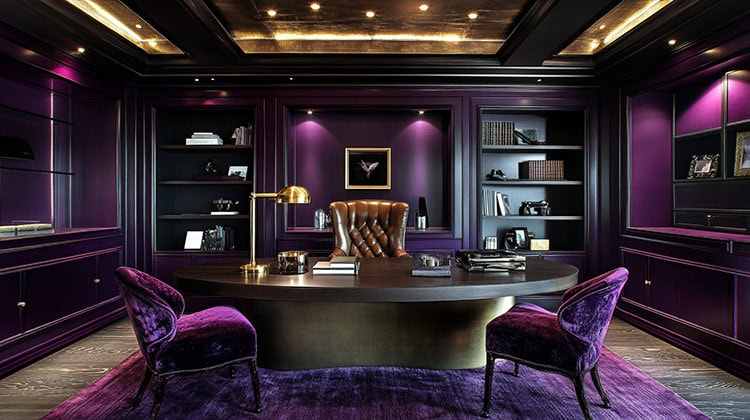
As mentioned earlier, color has a big impact on moods. Because of this, it’s important to think about what the purpose of the space is. Is it a formal room? Informal? Do you desire warmth and comfort or drama and sophistication? Asking yourself questions like these can really help you narrow down the right color(s) rather than picking colors that will result in a space that evokes feelings completely opposite of what you want. This might seem like a trivial thing, but taking the time to think your color choices through carefully– for each space in the home– will benefit you in the long run.
Are you ready to breathe new life into your home’s interior with color? If so, fabric is one easy way to do it! When you’re looking for interior fabrics, stop by one of our Cutting Corners locations. We have a wide selection of discount design fabrics that will suit your color revival and any other interior project you’d like to accomplish.

