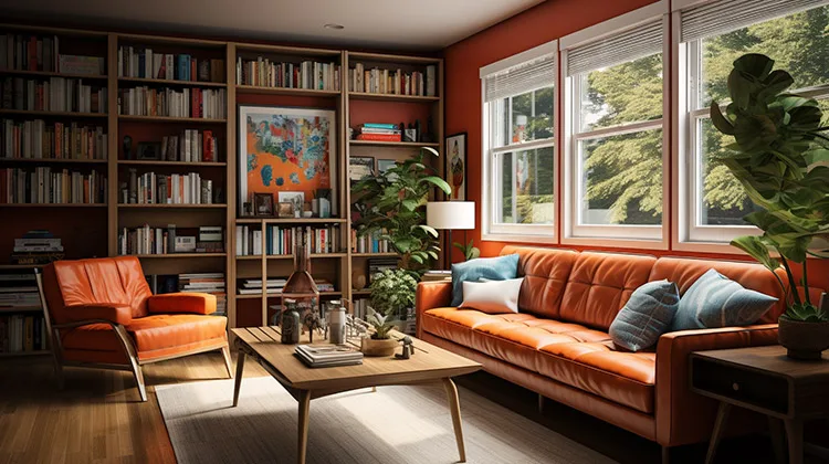
Incorporating bold colors into a home that blends mid-century modern and farmhouse design can be a fun and creative way to add some personality and vibrancy to your space. Here are three ideas to get you started:
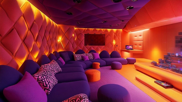
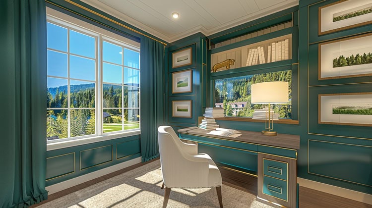
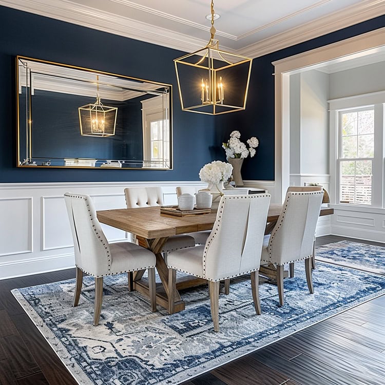
- Accent Walls: Consider creating an accent wall in a bold, statement-making color. This can be achieved with paint, wallpaper, or even a large piece of art. Choose a color that complements your existing color scheme and adds visual interest to your space.
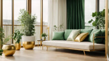
- Colorful Accessories: Another way to incorporate bold colors is through the use of accessories, such as throw pillows, area rugs, and curtains. Choose items in colors that pop against your neutral furniture and walls, and mix and match patterns and textures to create a layered and interesting look.
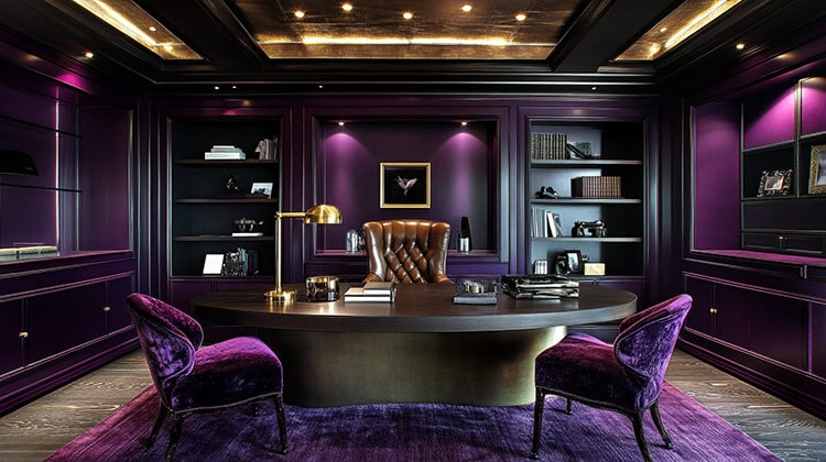
- Statement Furniture: If you’re feeling bold, consider investing in a piece of statement furniture in a bright or bold color. This could be a vintage mid-century modern armchair in a bright yellow or a rustic farmhouse dining table in a deep forest green. This approach can add a playful and unexpected touch to your space, while still maintaining the overall design aesthetic.
There are some things to keep in mind while you are anchoring your space in neutrals first before adding bold colors:
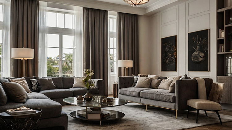
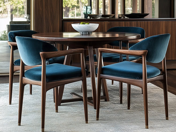
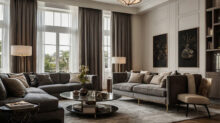
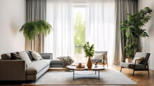
- Stick to a neutral palette of whites, creams, tans, light woods, and black for your larger pieces like sofas, beds, dining tables, etc. This creates a calm, grounded foundation.
- Choose neutral wall colors like white, beige, gray or warm whites. You can even do neutral tones on accent walls to allow the bold colors to pop.
- Use textured neutrals like jute, linen, or cotton on your textiles. Layer natural fiber rugs, curtains panels, pillows before bringing in bold patterns or colors.
- Craft a cohesive neutral backdrop first, then layer in bold hues thoughtfully over time. This helps avoid the bold colors from feeling random or overwhelming.
- Anchor spaces with neutral elements like wood floors, ceramic tiles or concrete. Their solid, grounded presence balances bold pops of color.
- Mix natural wood elements like dining chairs, coffee tables, shelving with your neutrals. The warm wood tones will make the bright colors feel curated.
- Balance out bold artwork or accessory colors with plenty of neutral space around them. Don’t overcrowd the neutrals with too many bright pieces.
The goal is to make the neutral backdrop feel intentional, not haphazard. A well-thought out foundation allows you to refresh with bold hues that feel cohesive and energizing. Take it slow and build up the color over time.