Have you ever walked into a home with all the right colors and you think to yourself, “I want to do that in my home”? If that’s the case and you found yourself at the paint store, how did it go? Did you find what you wanted or did you end up staring aimlessly at the endless spectrum of colors? If it was the latter, you’re not alone. Picking colors for your home can be an incredibly daunting task!
Ultimately, you will choose the color scheme from your home. Even if you were to hire a professional to help you out, you’d have some say in the colors chosen. After all, the colors should reflect who you are, as well as your personal style, right? The thing is, the colors should also make sense within the space. And that’s where you might not succeed on your own— taking those colors you enjoy and using them harmoniously throughout your home.
When it comes to adding color to a home, it’s easy to see where things went wrong after it’s done. But wouldn’t it be better to avoid getting to that point in the first place? To help you become more confident in your quest for color, here are some common color mistakes that should be avoided in home decorating.
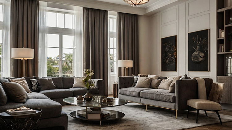
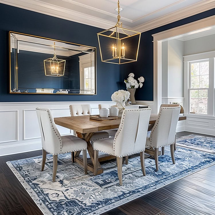
1. Ignoring the rule of 60-30-10.
Following the 60-30-10 rule will really make a difference in your space. When decorating the space, narrow your color choices down to three: 60 percent will be the dominant color, 30 percent will be the secondary color, and the remaining 10 percent will be the accent color.
What does that look like in decor terms? A prime example would look like this:
- 60%: wall color (paint or wallpaper), accent pieces, area rugs, sofa, and large “foundation” pieces
- 30%: draperies, bed linens, accent chairs, painted furniture, and accent walls
- 10%: artwork, throw pillows, patterned fabric, and decorative accessories
In general, this 60 percent + 30 percent + 10 percent rule is there to keep things in proportion. While it’s such a simple concept, it offers great results in giving balance to the colors used in any space.
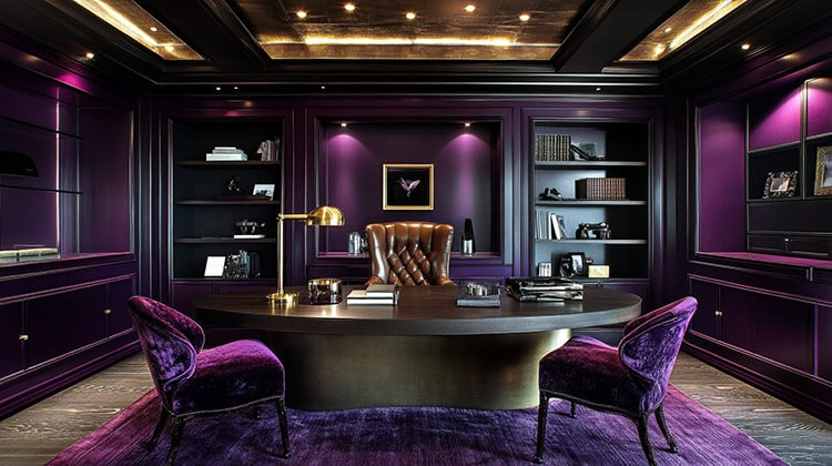
2. Not understanding the basics of color.
Before you delve into home decorating, it’s important to at least understand the basics of the color wheel and how basic schemes work. It’s also important to realize that a neutral color doesn’t just limit you to beige.
Neutrals come in a wide variety of shades and tones, so there is no reason to stick with creams and whites unless you really want to. The concept of neutrals just means that there is a balance of warm and cool tones, which means that even a color as bold as red, can be considered a neutral.
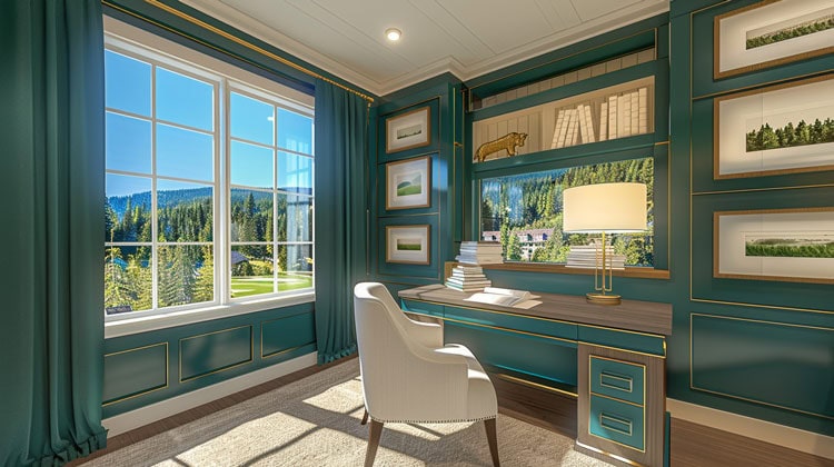
3. Forgetting about lighting.
Keep in mind that colors look different in certain kinds of lighting. What looks gorgeous in natural lighting, could verge on hideous when illuminated only by lamps. Before you finalize your selections, take home oversized paint chips or sample-size bottles of your favorites. Tape them or brush them on the wall and watch how they change during different times of the day. It might not seem like a paint chip could possibly change that much based on the lighting, but it can, which is why testing color out in different lighting is so important.
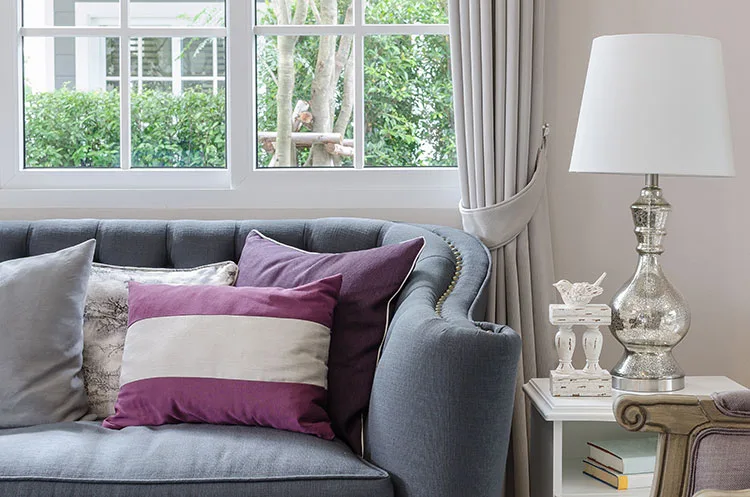
4. Trying to match an object.
If you have a favorite object, whether it’s furniture fabric or an accent piece, that you want to stand out from the rest of the items in your home, you won’t do it with a backdrop in the exact same color. Instead, find a softer, subtler version of a similar color so your favorite piece really pops.
5. Jumping on the latest trend.
Trends come and go, which is why you should be aware of the reasons behind choosing your colors. There is nothing wrong with loving the hottest color of the year, but be careful how you distribute it. Wall colors are easier and less expensive to change, but something like a couch in magenta isn’t. Be sure to stick with furniture choices that will stand the test of time and save the trendy colors for walls, bedding fabric, and accents. The ultimate goal should be to have colors within your home that you truly love.
6. Avoiding colors that have traditionally been considered gender-specific.
Gone are the days of pink only being for girls and blue for boys. Just look at any annual Pantone color palette, and you’ll see that those colors, along with other colors once associated with gender, can be used anywhere. And, throughout all seasons of the year! Don’t be afraid to incorporate colors like that into all areas of your home. When done right, they can be pleasing to anyone!
As you add color to your home, be sure to visit us at Cutting Corners where you can shop for your favorite designer fabrics and accessories for a fraction of the cost!