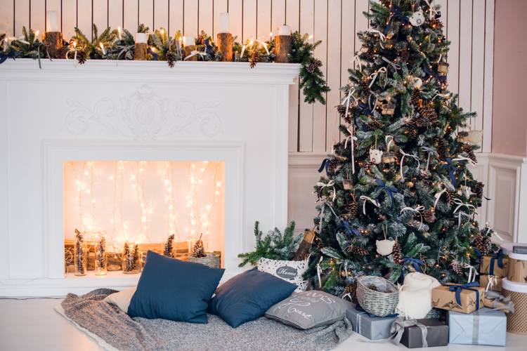
Pantone, the color experts, recently released their predictions for fall’s hot colors. This year, you can expect earthy neutrals mixed with invigorating pastels. Pantone considers this the first truly unisex palette, making it ideal for feminine and masculine spaces.
According to Leatrice Eiseman, Executive Director of the Pantone Color Institute, This season displays an umbrella of accord that weaves earthy neutrals with a range of bold color statements and patterns to reflect a landscape of hope, fun, fantasy and all things natural. The colors are evocative of a love for nature and a timeless appreciation for warmth and security, which are conveyed through naturally-inspired colors that remind us of things that are real and protective.
Let’s take a look at what the top 10 colors are for fall 2015 and what the Pantone website has to say about them:
-
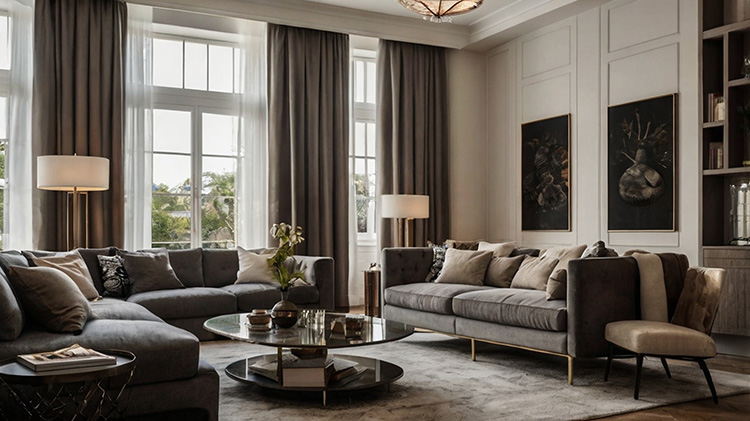
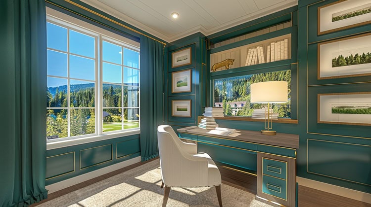
- Desert Sage: a cool and soothing greenish-gray timeless and unobtrusive, yet powerful enough to make a statement on its own.
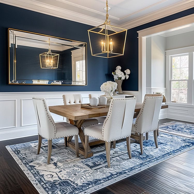
- Stormy Weather: reminiscent of the sky on a gray, overcast day dependable, cool and above all, constant. Implying a quality and luxury, it is a powerful blue-gray that is strong, protective and enduring.
- Oak Buff: mellow, comforting and warming the golden-yellow acts to nurture and comfort.
- Dried Herb: sophisticated and chic an organic shade redolent of nature’s earthy fragrances.
- Marsala: a winey red-brown that adds finesse and savoir-faire rich and robust, it incorporates the warmth and richness.
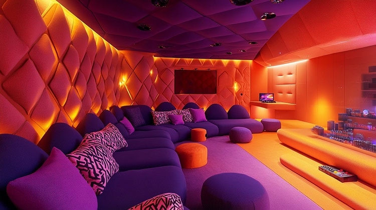
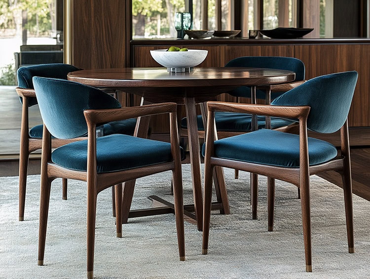
- Biscay Bay: a lush and elegant teal this cool and confident tone inspires thoughts of soothing tropical waters, transporting us to a place that is pleasant and inviting.
- Cadmium Orange: a nod to the ˜60s and ˜70s that evokes a sentiment of optimism, fun and fantasy. Playful and sophisticated in its appeal, it’s a warm, welcoming and subtly dramatic hue.
- Cashmere Rose: a play on the ˜60s with a twist of today, this luxurious color is a tactile and soft pink hue that renders exactly what it promises. Displays a gently persuasive and composed pink that is more upscale than downtown.
- Reflecting Pond: a cooling blue that adds dimension and intrigue to the Top 10. A serious shade that speaks to the need for stability and security.
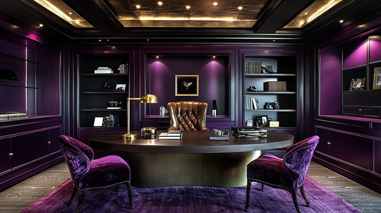
- Amethyst Orchid: Intriguing, vibrant and somewhat sensual, this enigmatic shade is an extraordinary hue that is unique, bold, creative and exciting.
So there you have it! See anything you’d like to add to your home this year?